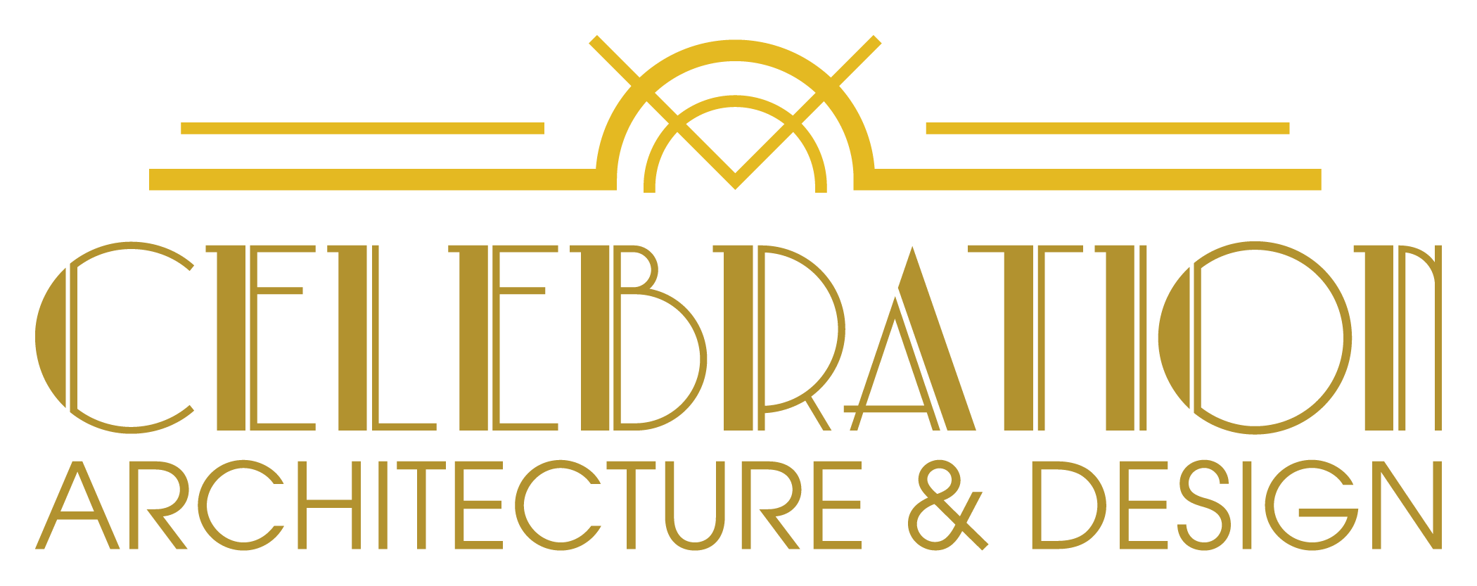
Like many design projects this logo went through numerous iterations, beginning with versions that incorporated additional architectural tools into the words. A simplification process yielded the final product, a combination of an art deco typeface and graphic ornaments with a subtle compass tool — together this symbolized the architecture firm and its location in a town known for its art deco style. (2024)
This project was created doing consulting work for Celebration Architect. I do not maintain ownership or copyright of these images.
