

Wearable Tech
user experienceS in a square inch or less
In the Cedar Point Mobile case study I discussed many of the wonderful applications guests at attraction would have at their fingertips. But what if the setting was a venue such as a waterpark where mobile devices wouldn’t be available? Enter the age of interactive and interconnected technology that can be worn on one’s wrist — and it’s waterproof too!

The Prism band by accesso was developed as a successor to their popular Q-Bot devices used for virtual queueing. While the new band would have that ability, it also offered a much wider array of features to enhance the park experience.
While the advent of the Apple Watch helped user in a brand new era of computing power on one’s wrist, the impracticality of venues charging devices daily necessitated some hardware design choices and limitations. As such, it was important to craft the user experience to be specific to the Prism band while still utilizing some of what users had become accustomed to with their own devices.
Hardware Constraints
I first joined the project as a UX/UI consultant when the company engineers and client representatives needed to meet in London to finish up final deliverables shortly before go-live. The initial set of requirements was customized for a new major waterpark in Orlando and as such much of the work was already complete. Nonetheless I was jumping in to something brand new that the world hadn’t seen yet — I had much to learn.
The hardware constraints presented a variety of unique design challenges not present in other form factors:
Small Text & Graphics
With a 144×168 resolution screen, every pixel had to count.
Black and White Palette
Each pixel on screen was either pure black or white to conserve memory.
Haptic Feedback
Short custom pulsing vibrations could provide users with a tactile response.
Gesture Interactions
Due to sensor configurations, only full-screen swipes would register, no taps.
Wireframing
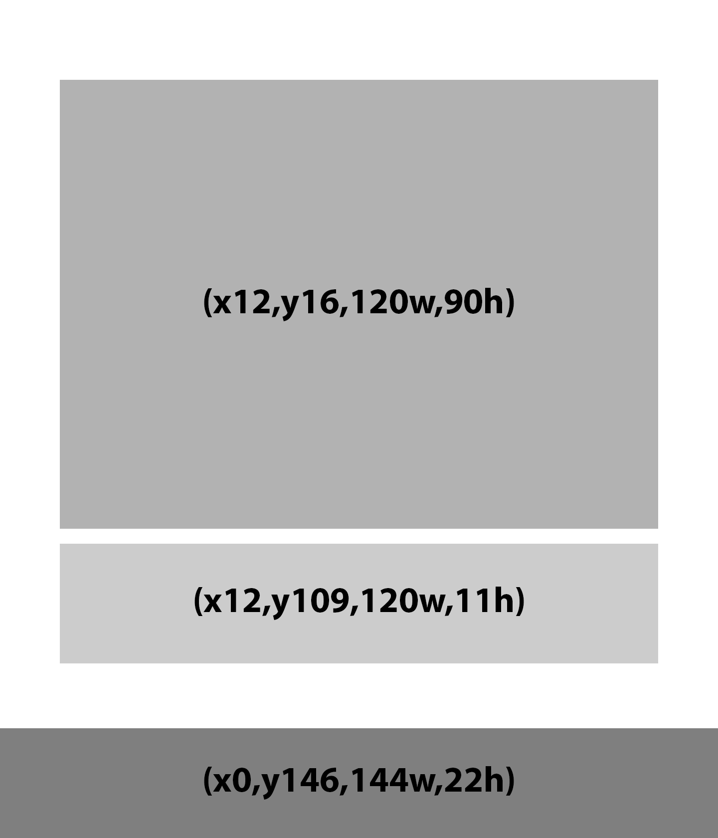
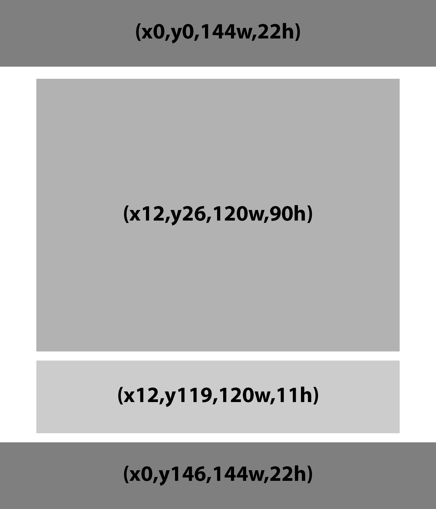
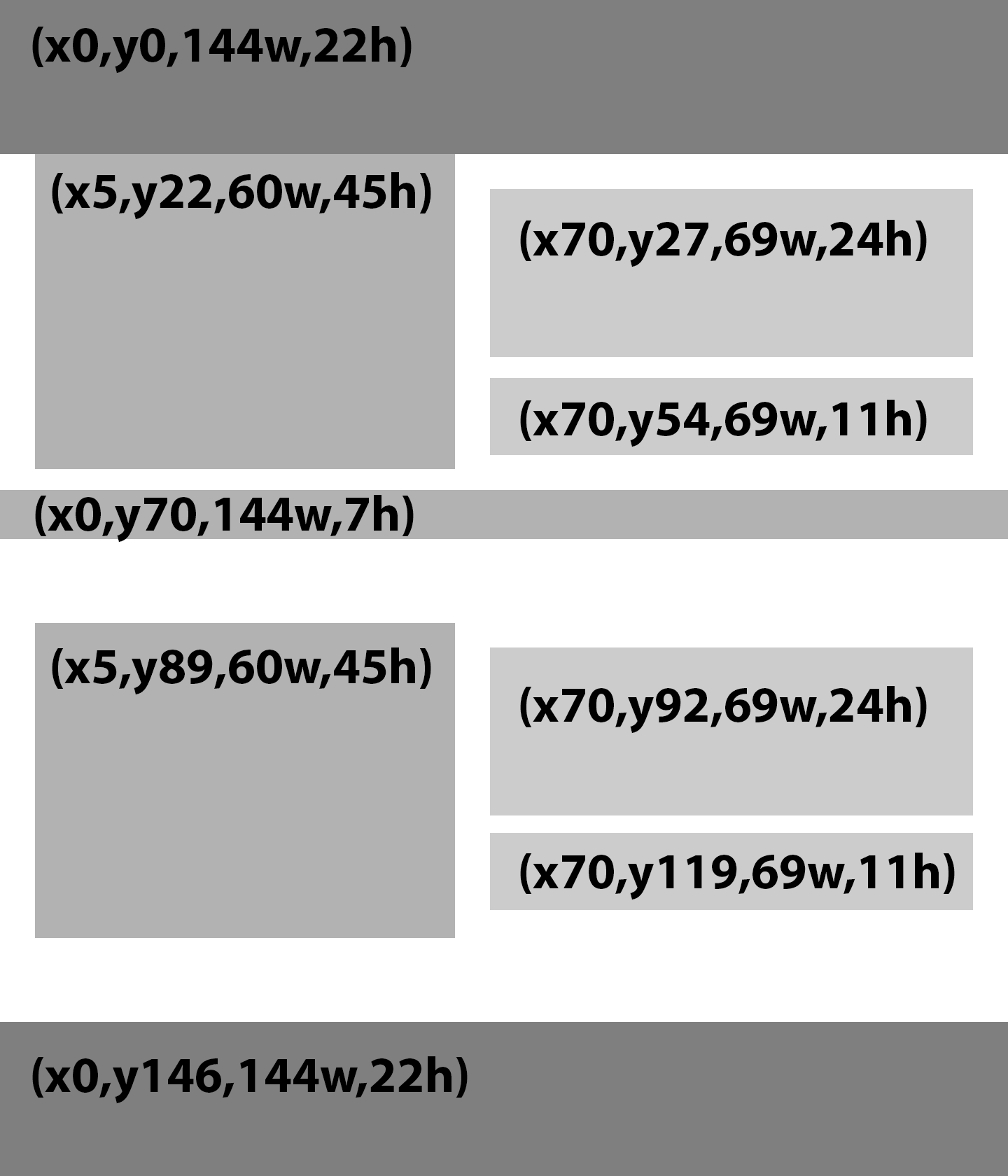
One of the first tasks was to reorganize content on the screen to make text more readable and the custom attraction graphics larger without compromising on memory limitations. Icons were edited at the pixel level and handed off to the engineers for quality assurance. Several layout templates were wireframed to show boundaries for graphics, 1-2 lines of text, action buttons and optional status indicators; an additional layout allowed for a use case of two attractions on screen at once and featured graphics resized by a clean scaling factor of 50%.
With a revamped set of icons, a larger font and an improved visual template my work was nearly complete — the last part was to optimize the haptic feedback “taps” that would notify the user of an important message or action that needed to happen. Multiple sequences were created for both passive and urgent communications with different combinations tested on real humans for the best impact. Care was taken to not exceed a daily expected “budget” of vibration durations to help preserve battery life.
A New Flow
The next phase of the project involved producing a common interface and user flows geared towards multiple clients. Using the device’s long range radio, guests would now be able to virtually queue for rides from anywhere in the park; they could also receive marketing messages and other alerts.
The guest journey for reserving rides, replacing and cancelling reservations was detailed in a series of templates designed in Photoshop and run through a posterize filter to simulate readability in pure black and white pixels. Icons, modals and other elements were all built to fully utilize the screen’s available real estate.
Since the embedded sensors could not detect taps, only the consecutive swiping across multiple sensors, there was much debate over how to both proceed and go back. While moving one’s finger from left to right could signal forward progress, the same gesture has been adopted on mobile browsers to go backwards. Since right to left was not a suitable alternative, I pushed for confirm actions to respond to any horizontal swipe. Back actions were included in modal menus; an additional step perhaps, but one that was not going to potentially confuse users.

Additional research led to some interesting findings. While the screen could not support any pixels beyond black and white, given the density of those pixels it was possible to simulate grey by showing an alternating grid pattern. One application of this was in displaying a 50% opaque dark border around modal windows — it was simply an overlay of black pixels above the underlying screen, but it did the trick into conveying depth.
Multiple varieties of typefaces were also tested for legibility at different sizes. In the end, none performed better than the original Proxima Nova.

Iterative Design
In terms of the user flows, feedback showed that the modal menus for confirming/going back were slightly laborious. A new iteration simply allowed for dual actions signified by gesture directions on screen. The replacement views ended up being more clean, concise and understandable to users.

World of Color

Hardware improvements would lead to a second generation of the Prism band and would include the ability to use taps in addition to gestures; a very limited 8-color palette was also available. Similar to how greyscale was developed by mixing black and white pixels, an additional 28 “colors” were made available.
Using the previous flow as a starting point, color was added to signal action buttons, modals, icons and critical messages.

This case study references projects created while employed at accesso. I do not maintain ownership or copyright of these images.