

Thinking Small
Taking Cedar Point into the mobile era
Cedar Point has been called “America’s Roller Coast” and been voted “Best Park in the World” many years over. Home to some of the best rides on the planet, this thrill-seekers paradise in Sandusky, Ohio has also been a leader in the digital realm. During my time working at WDD – We Do Digital, I was first involved in updating the primary website, followed by creating a brand new site design in June 2008. Around this time the iPhone was only a year old but its impact was immediate — suddenly the web was truly available wherever we went. How could Cedar Point adapt to this new paradigm?

When the new site design was being assembled, it wasn’t just a visual refresh — much of the backend was overhauled including some complex database structures under the hood. With so little of the final presentation melded to any underlying data, this allowed for great flexibility in what we could do with that data. More on that in a sec.
While the site was usable and looked good on my iPhone, certain features such as Flash widgets weren’t supported. Worse, the graphics were a drain on the 2G connections at the time. While a small handful of other parks had dipped their toes into a more mobile friendly site by this time, functionality was often limited to very basic information such as directions and calendar hours.
The Cedar Point main site had a LOT of content. Now it was time to see what else we could do with it…
Uncharted Territory
The first thought was: what should the user experience be like? I came up with a list of goals that made sense as an actual park goer:
Fast delivery, minimal graphics
Clean presentation with large text
mobile-specific navigation
Reduced Content
Location-based Actions
Planning began in April 2008, and a prototype was quickly thrown together over a couple days to present to park management to sell them on the concept. (Turns out it was a no-brainer.)
There was no concept of a responsive web yet, but an elegant solution presented itself. When a user visited m.cedarpoint.com or followed a “view mobile site” link, we set a flag that swapped the presentation from a desktop template to a mobile one. Browser detection would make this even easier later on.
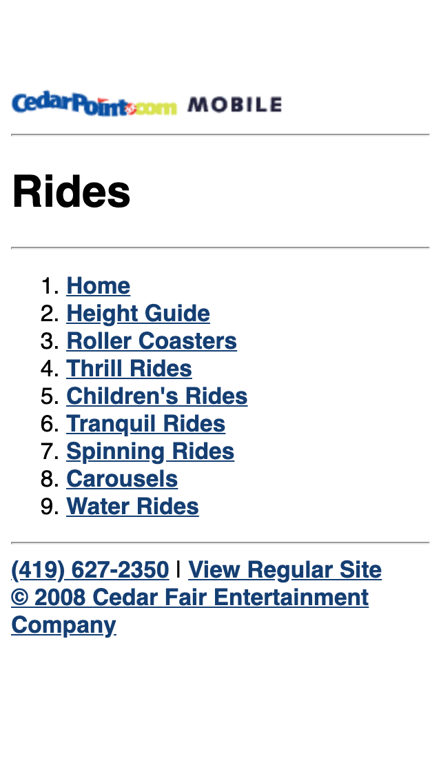
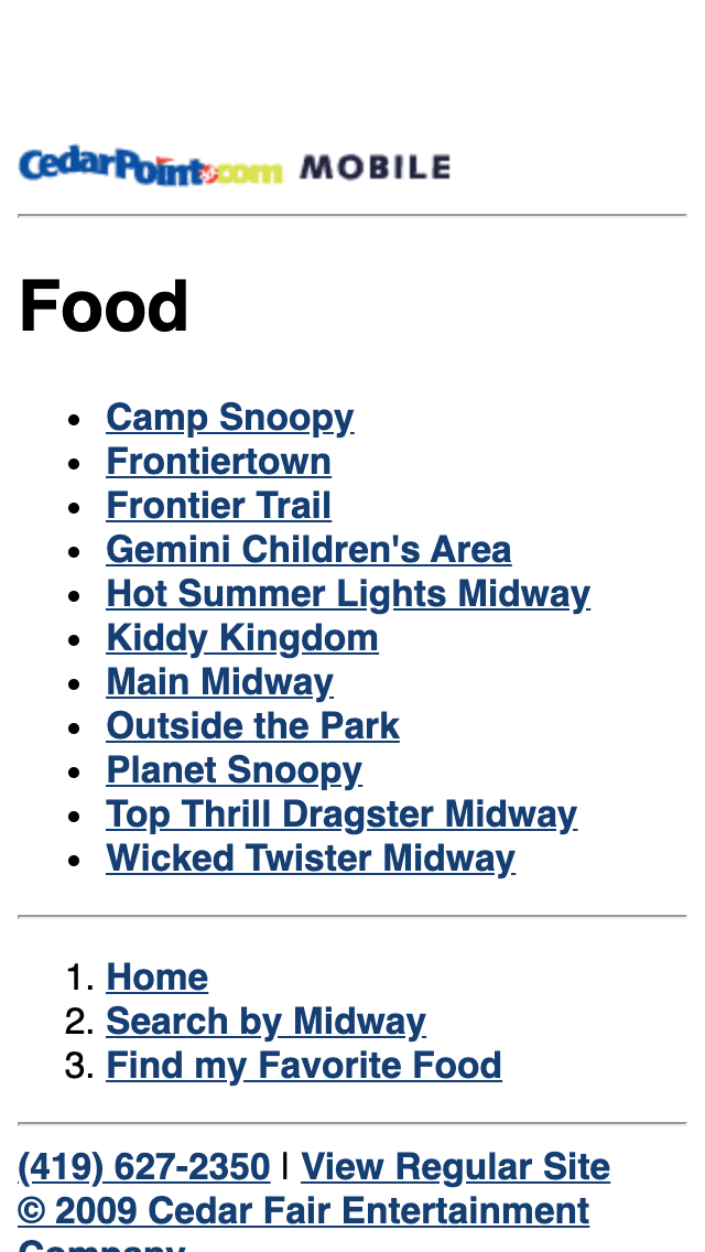
The visual appearance was incredibly basic and stripped of most graphics besides a logo. This allowed the user to focus firmly on what they needed. I envisioned two primary use cases — people who aren’t in the park vs people who are. The first group will be more interested in getting ticket information, future hours and travel info. When they’re there however, little of that matters! Instead, an “At the Park” menu brought more useful information to the forefront — maps, ride information, show schedules and even food locations with full menus.
Scroll through to see all eight screenshots:


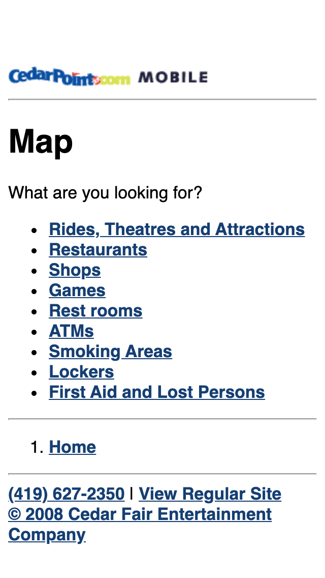
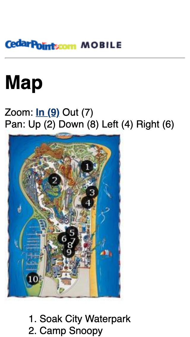

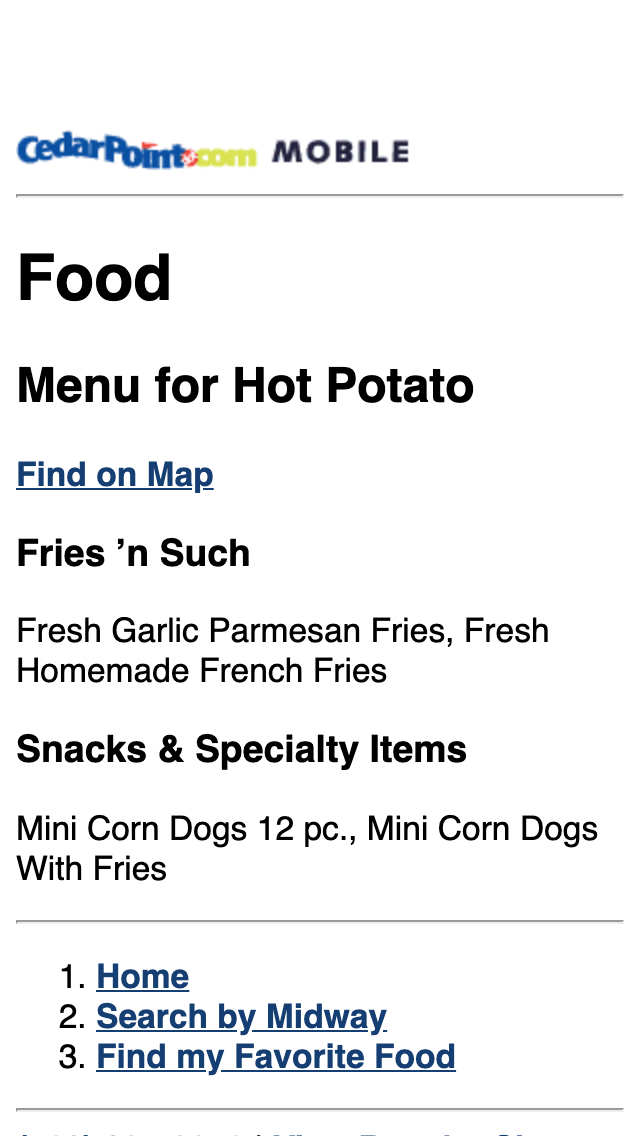
The mobile site was even slightly ahead of its time as it utilized location-based features before GPS was even built-in to phones. I got around that by offering a search field that asked users to input a nearby ride or other landmark; that queried a database of like-sounding points of interest (POI) which provided a useful starting point for additional searches (“where’s the nearest bathroom?”). Since we also associated each POI with location data, the user could see results conveniently displayed on map.
Overall the mobile website was a pioneering trendsetter for the amusement industry, and many of the original ideas and functionality created for it were slowly adopted by competitors big and small over the next several years. But by then, there was an even newer technology to consider…
Planet of the Apps
By early 2011, Cedar Fair was entertaining offers from outside suppliers to develop apps. Given the complexities of learning two new and very different languages (Objective-C for iOS and Java for Android), this seemed out of our wheelhouse — that is until I learned of a framework called Appcelerator Titanium. Code once in javascript, output native applications with relative ease. And since the databases powering the websites could be channeled towards mobile app consumption (and thus park staff wouldn’t have to duplicate tons of data entry), it became clear that WDD would be the best option. A working “MyPark” prototype took three weeks to assemble. Soon after, we got the go-ahead for the full app experience.

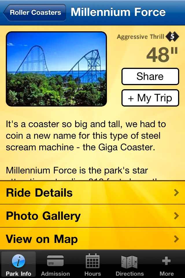

Interface-wise, I had a bit more freedom to be more expressive with the visual design however I still held to the belief functionality should be separated between in-park and out-of-park sets. To do that, I adopted two common patterns at the time: an ever-present footer toolbar for quick access to park options as well as admission, calendars and more. The park home screen utilized an icon-grid format the Facebook app had popularized. By incorporating easily-identifiable icons alongside text, the goal was to make the experience simple and frictionless for first-time users of all competencies.
Of course, simply duplicating the mobile website functionality wasn’t an option — I had the opportunity to utilize the hardware at our disposal to further enhance the experience. Among the most important was on-device storage; I could use a database to save users’ favorites in a “My Trip” feature to assist with visit planning. Even better, the app architecture was designed to cache all server data (aside from some imagery and anything needing live updates); this meant that at a time when Internet connectivity in some park areas was poor or non-existent, the app would still be largely usable.
Direction Setting
Location-based services were the killer feature of mobile devices, and the advent of more precise GPS chips allowed app developers to create amazing custom localized experiences. Users could also ditch the old atlases and MapQuest printouts as map applications provided instant directions.
That was great for getting from your house to the amusement park, but an entirely different problem surfaced once a guest set foot in the gate…

Park-goers have become accustomed to highly stylized illustrated maps. These typically dispense with any sense of scale nor do they align with “up” equals North.

Online maps (rendered and satellite) on the other hand are by necessity properly oriented and to scale.
A dilemma is presented. How should we capture a guest’s GPS lat/long position and place them on a visual map? The app could show satellite imagery, but it’s cluttered and often out of date… bad idea. The other option is to completely redraw a park map with everything to scale, but this involves considerable initial effort and costly updates every time attractions and midways change.
What if there was a better solution that incorporated the best of both worlds? Turns out there is! I just had to learn matrix algebra.

While initial attempts at trilateration were less than successful, I discovered an alternative but similar solution where I could take a user’s precise GPS coordinates and then query four nearby POIs for their lat/long locations. Imagine the “shape” these points create around the user’s location.

The database has not only lat/long data for each POI but also its position on the illustrated map. Using something called an affine transformation, the shape then gets warped — the benefit being that the user (the purple star) is shifted proportionally with this distortion. We end up with a high degree of confidence to place the user on the illustrated map!
While there was a lot of initial research and later testing to ensure results were accurate, the technology ended up being relatively simple to implement and was lightweight — enough to run continuously on the device. The effect was cool to watch as one’s location on the illustrated map would animate in real-time as the guest walked along the midways.
Dead Ends and Detours
In 2012 a leadership change at Cedar Fair ushered in a new era of partners, particularly in the digital realm. Change is inevitable — particularly with regard to business decisions — and by summer each park had new sites and apps. Nevertheless, the “MyPark” apps would find new life by adapting for a variety of other attractions such as zoos, small parks and festivals.

The technology would continue to evolve, particularly the map functionality. App admins were given the ability to interactively mark sidewalks and other walking paths through their attractions, which then provided the data to use an A* (A-star) search algorithm to traverse the shortest / optimal route between two points. As guests in the park used the app to find points of interest, the map view would automatically highlight the path to get there.
Server-based enhancements later allowed for multiple illustrated maps to be connected together. A proof of concept showcased my college campus; a user in a room on a floor of their residence hall could get wayfinding instructions to their classroom on its own floor of its own building.
Final Thoughts
Though the specific implementations used to create the mobile websites, apps and maps are all largely obselete and no longer in use, I gained a significant amount of experience developing groundbreaking techniques that took the amusement and attractions industry in new directions and benefitted millions of guests. More important than the technology however was the mindset of ensuring those individuals never noticed it — instead, regardless of device or form factor, they were simply able to accomplish their goals.
I firmly believe we’ve only scratched the surface on mobile interfaces and use cases. Since 2013 I’ve stressed that voice activation, artificial intelligence and predictive personalization are all technologies waiting to be pursued.
This case study references projects created while employed at WDD – We Do Digital. I do not maintain ownership or copyright of these images.