LGBTQ+ Campaigns
Fighting for Equality — in Style
Give anyone in the LGBTQ+ community a list of personal attributes and most will say authenticity is the most important. The same applies to messaging and advertising — reaching out to these individuals needs to stem from a place of understanding and empathy. Audiences are smart, they know when they’re being pandered to. Creating campaigns that promote LGBTQ+ related events and encourage participation are immensely challenging, but a successful endeavor is nothing short of magical.
The “Games” is ON.
When I joined the Gay Games 9 marketing committee in March 2012, approximately 2.5 years before the event, some initial branding pieces such as typography and color style guides were in place but little else. What was needed the most was a hook.
The Gay Games had always been held in major world cities like NYC, San Francisco and Sydney. In such a metropolis, a major LGBTQ+ event is often simply another event. But in Cleveland + Akron, this would be the major spectacle of the summer.
I’d like to think that every designer brings a bit of personal influence to each project. I felt that the Games were less about simply sport and more about how an LGBTQ+ sporting competition could be held in the Midwest. That by having it in Ohio, far from other liberal enclaves, it would be making history.
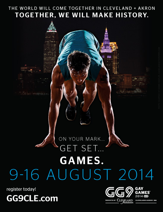
That led to one striking image. A track sprinter about to take off. A city ready to set a record. And the “On Your Mark, Get Set… Games” slogan would last as the primary campaign for quite some time.
A Different Angle
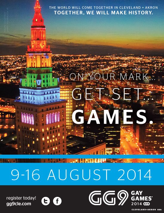
A little less than a year before the event, a new marketing campaign was needed to infuse new life into communications and excite prospective participants about registering for their favorite activities. While “On Your Mark, Get Set… Games” was a fabulous teaser, it didn’t have the flexibility necessary for this next phase.
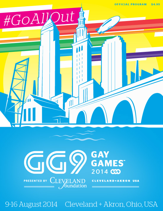
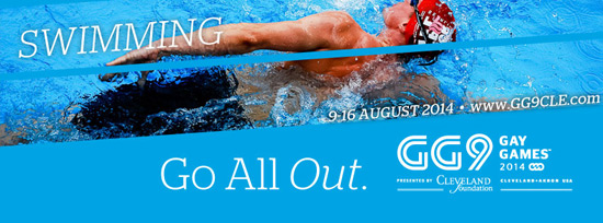
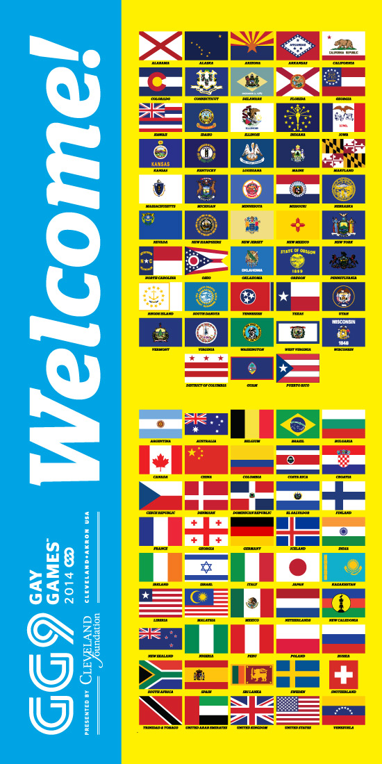
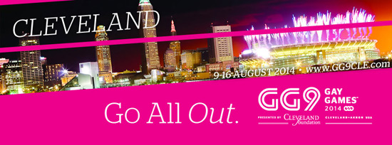
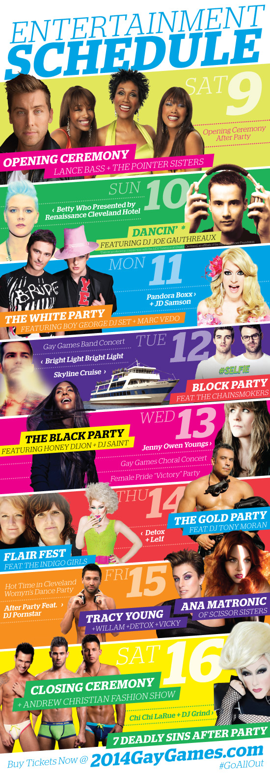
The end result was a combination of efforts between two Cleveland agencies and provided the framework for digital and traditional advertisements moving forward. With a bold color palette that evoked rainbow colors (without copying traditional hues) as well as a sharp angled template that added flair to numerous layouts, I was able to build off that foundation and create everything from social media event headers to posters and even 6′-tall totem signs.
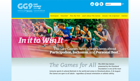
The design foundation also translated into a website refresh which I helped to oversee. Graphics, typography, colors and photo treatments were all stylized to match other branding, lending to one cohesive marketing approach. Matching email templates provided one final piece of the puzzle — participants could register on the website, receive emails with pertinent information, get updates on social media, then view signage and media across the city, and everything was visually and thematically consistent.
Reaction to the Games was almost exclusively positive. Residents of both Cleveland + Akron rolled out the “rainbow carpet” to welcome athletes, and numerous participants who attended prior events said it was the best Gay Games yet. Finally it was the first Gay Games to not end up in the red — a true testament to the hard work and professionalism of everyone involved!
Behold the Swoosh
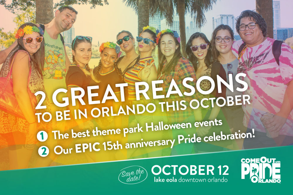
Volunteering for the Gay Games renewed my passion for volunteering, particularly within the LGBTQ+ community. When I was set to move to Orlando mid-2015, I wanted to continue those efforts. As luck would have it, Come Out With Pride was desperately seeking some graphic design experience.
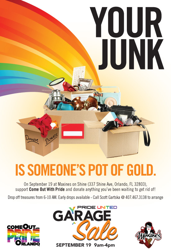
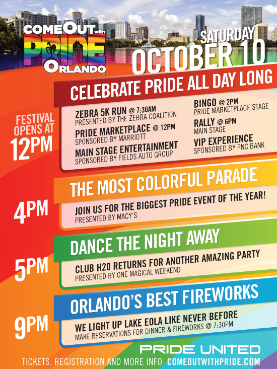
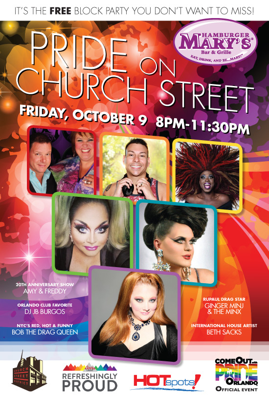
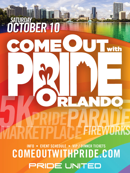
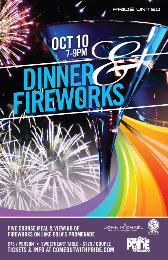
There wasn’t much to work with at first besides some logos, previous parade and festival photos and a stock image login. I found a rainbow “swoosh” graphic that was colorful and had a certain forward momentum to it. When the time came to create multiple advertisements for each of the main and secondary events, the swoosh appeared practically everywhere. It worked well for a campaign that was assembled and completed in the timespan of four months, but a new style guide with a refreshed color palette, typography and other elements was in the cards for 2016.
A Message of Healing
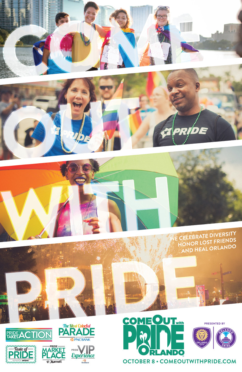
After taking over for Marketing & Communications, early in the spring the Pride style guide debuted a new teal primary color along with consistent typography options and photo treatments. Business cards, brochures and other materials followed. All that was left was to find a thematic message, but nobody could have foreseen what faced us next.
June 12, 2016 changed everyone in Orlando, especially those in the LGBTQ+ and Latinx communities. Our event, which was scheduled to be held four months later, would be the first large public gathering for many since the tragedy. Our messaging had to come from the heart:
Celebrate Diversity
Honor Lost Friends
And Heal Orlando.
We Keep Dancing
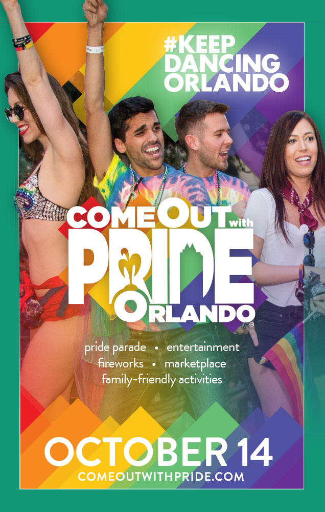
Pulse would forever continue to be part of Orlando’s legacy and as such Come Out With Pride’s as well. In 2017 I helped us partner with Push Creative, the agency responsible for the #KeepDancingOrlando campaign; they lent us use of the name, logo and other materials — in turn we debuted a themed dance area infused with the spirit of togetherness and celebration. The logo’s colors and stripe elements were also utilized in other designs to aid in continuity.
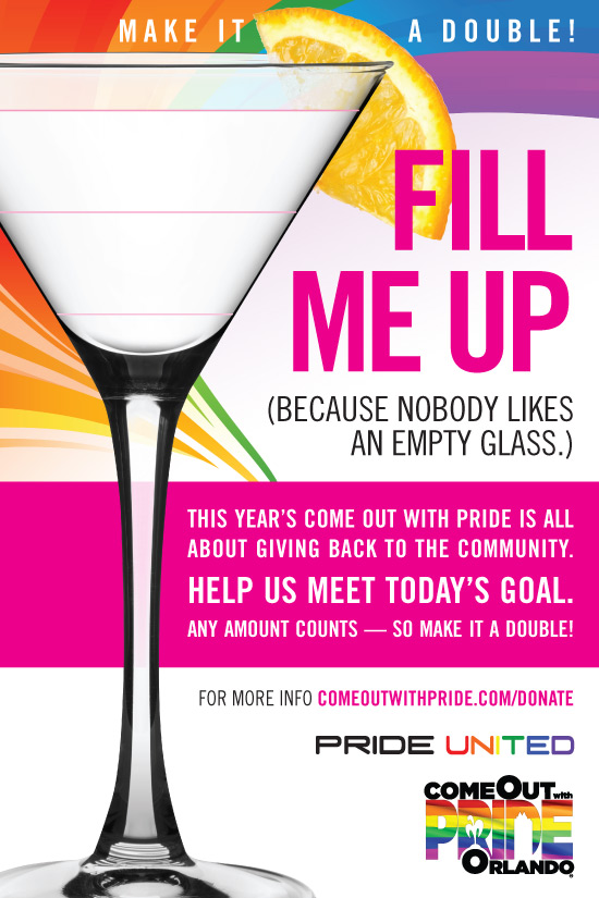
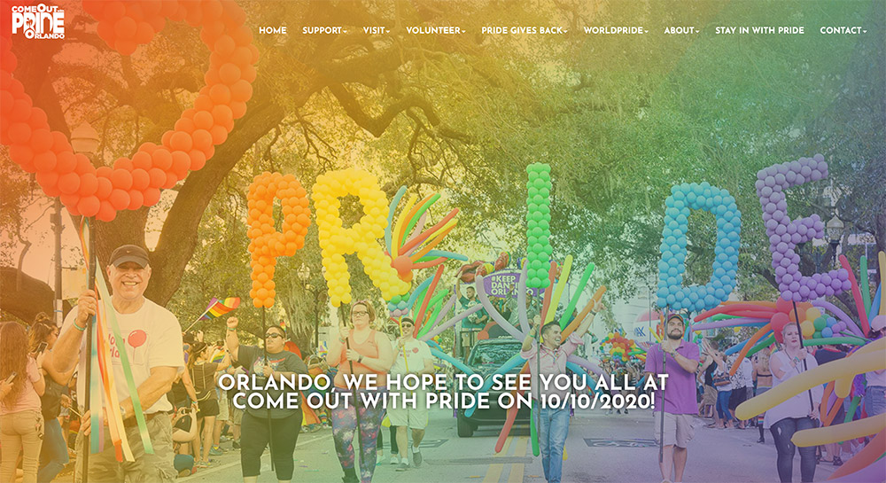
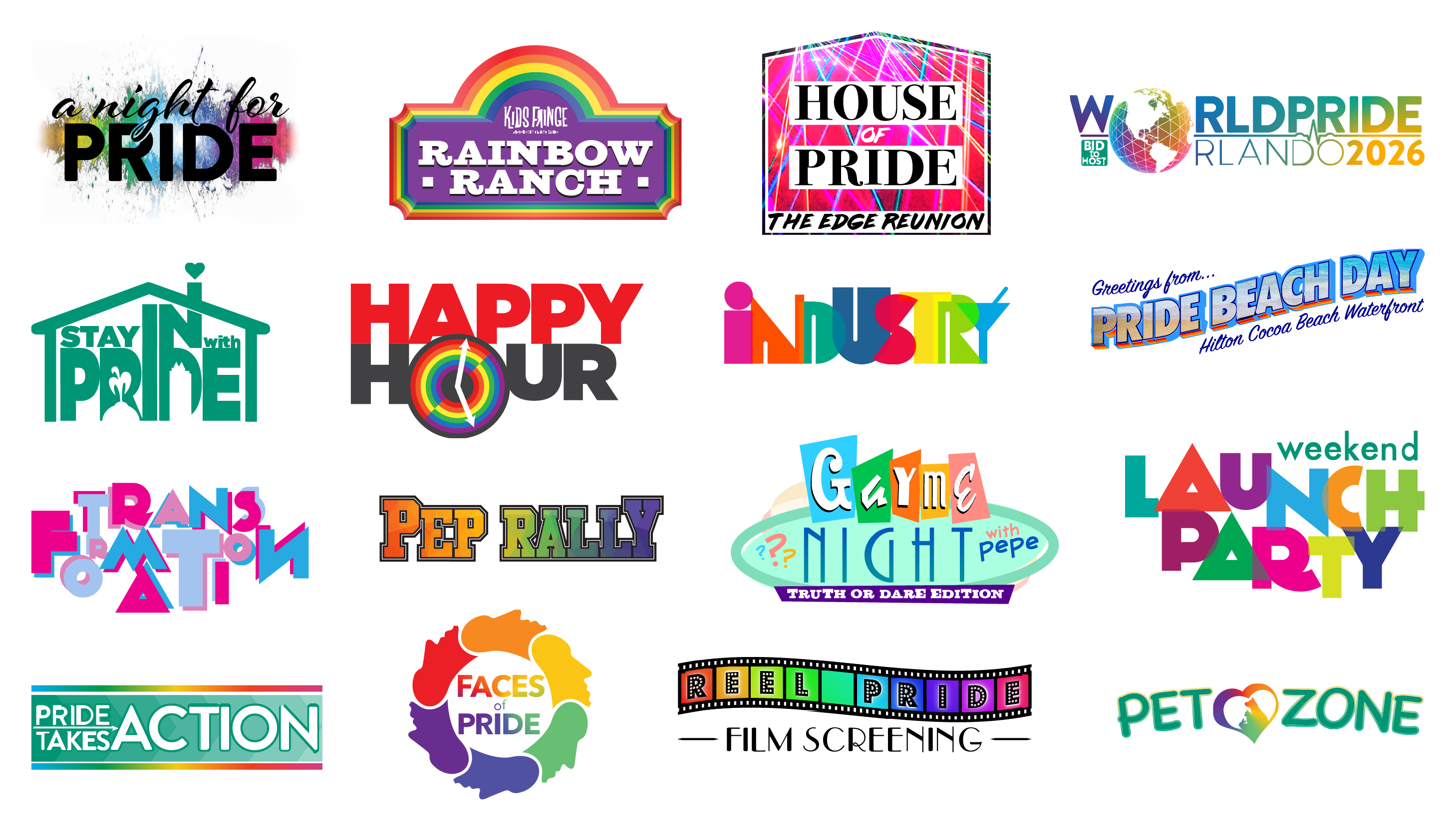
The years since would see continuous evolution of the branding with more rainbow colors and other pattern/gradient styles; secondary events would also gain their own identity with special logos. Yet the messaging would always be consistent: Pride is more than just a big celebration in Orlando, it’s a reminder that we need to stay resilient and keep marching towards progress and equality.
The Bid For WorldPride
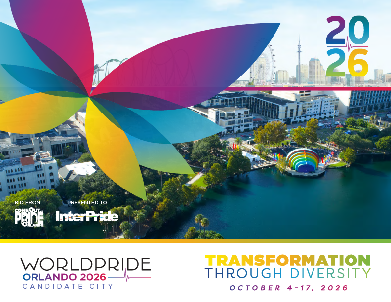
With the help of a talented team of writers, designers and branding experts, I led the monumental task of creating a 100-page bid book to explain our vision and hope to host WorldPride 2026 in Orlando. The design utilized powerful imagery of the community, with copy that took readers on an emotional journey from the tragedy of Pulse to the strength and rebuilding in the decade following.
This case study references projects created while volunteering for the Gay Games 9 and Come Out With Pride. I do not maintain ownership or copyright of these images.
