

LGBTQ+ Campaigns
Fighting for Equality — in Style
Give anyone in the LGBTQ+ community a list of personal attributes and most will say authenticity is the most important. The same applies to messaging and advertising — reaching out to these individuals needs to stem from a place of understanding and empathy. Audiences are smart, they know when they’re being pandered to. Creating campaigns that promote LGBTQ+ related events and encourage participation are immensely challenging, but a successful endeavor is nothing short of magical.
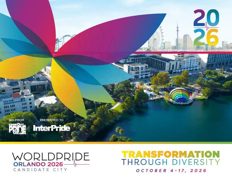
The Bid For WorldPride
We Keep Dancing

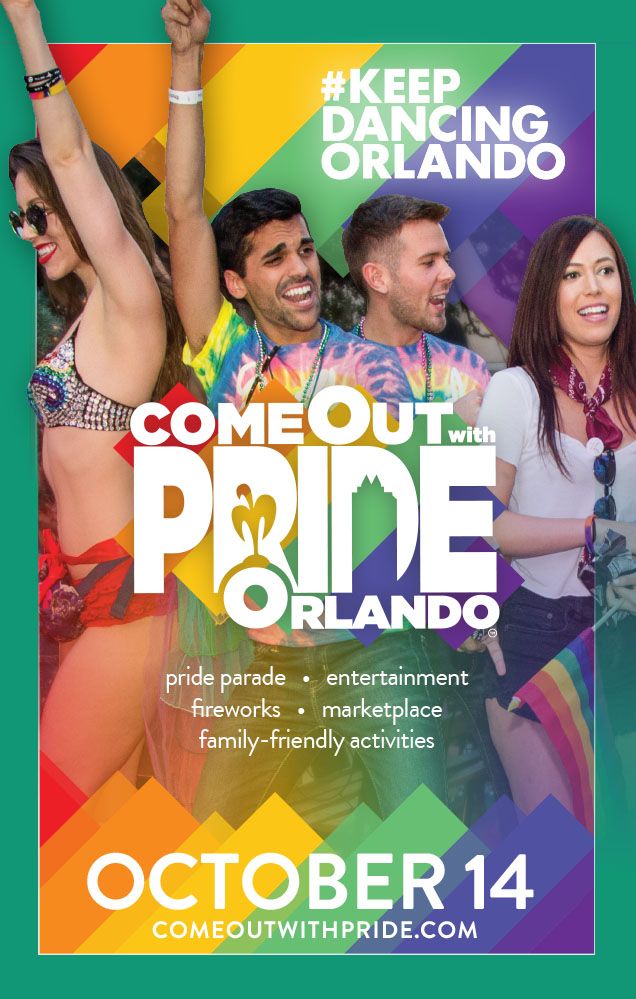
For the 2017 Come Out With Pride festival, I helped establish a partnership with Push Creative, the agency behind #KeepDancingOrlando. They shared the campaign name, logo and other materials, which we used to create a dance area rooted in togetherness and celebration. The logo’s colors and stripes carried through supporting designs for the event.
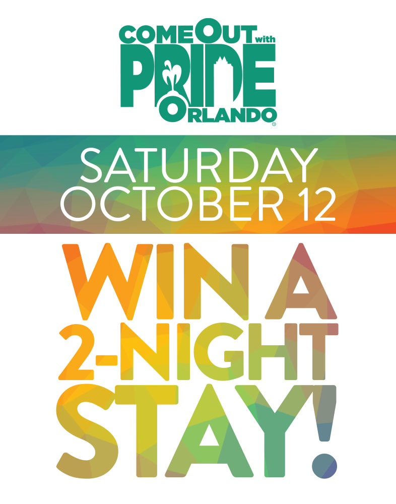
The dance area and its supporting graphics gave guests a place to celebrate together. Repeating the same colors and stripe details across the festival made the campaign feel cohesive while keeping its energy.
A Message of Healing
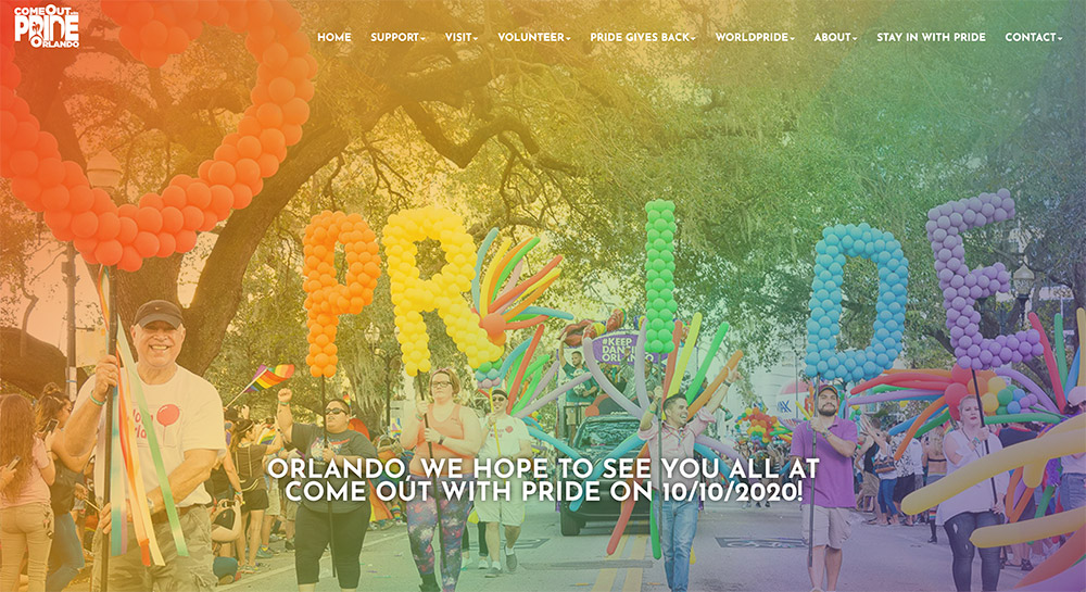
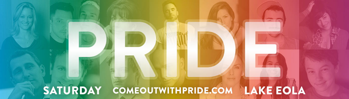
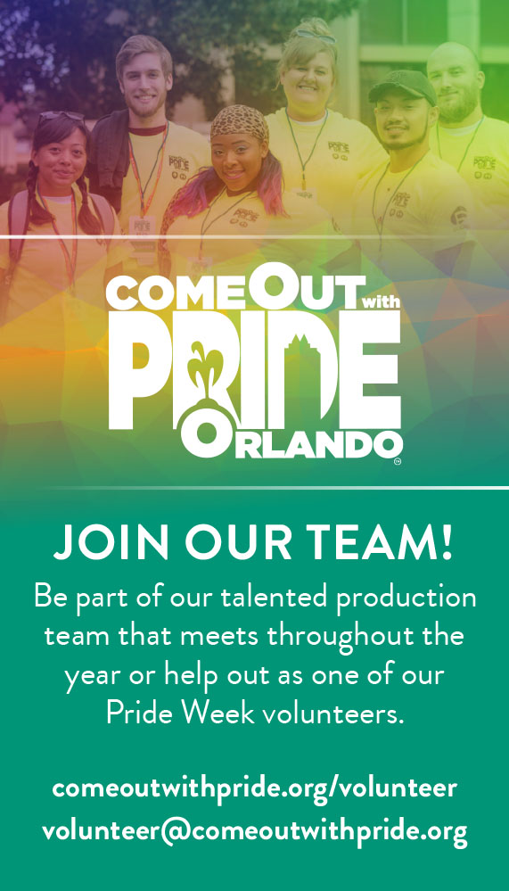
In spring 2016, Come Out With Pride introduced a teal-led style guide with consistent typography and photo treatments. I applied it across business cards, brochures and other materials as that year’s visual identity took shape.
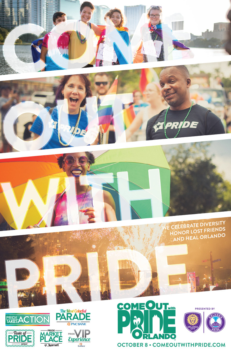
After the June 12, 2016 Pulse tragedy, that year’s Pride event carried a different weight for Orlando’s LGBTQ+ and Latinx communities. Scheduled four months later, it would be one of the first large public gatherings for many people. The campaign’s message had to speak honestly to grief, solidarity and healing:
Celebrate Diversity
Honor Lost Friends
And Heal Orlando.
Behold the Swoosh
When I moved to Orlando in mid-2015, Come Out With Pride needed graphic design support for its upcoming events. With a short production schedule and a small collection of existing logos and event photography, I began building a visual direction that could work across the campaign.
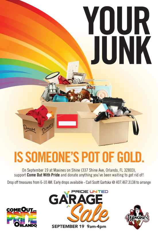
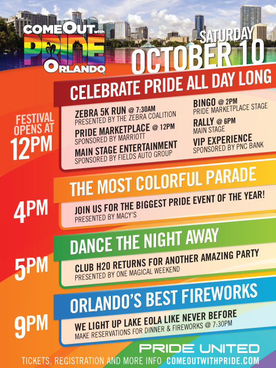
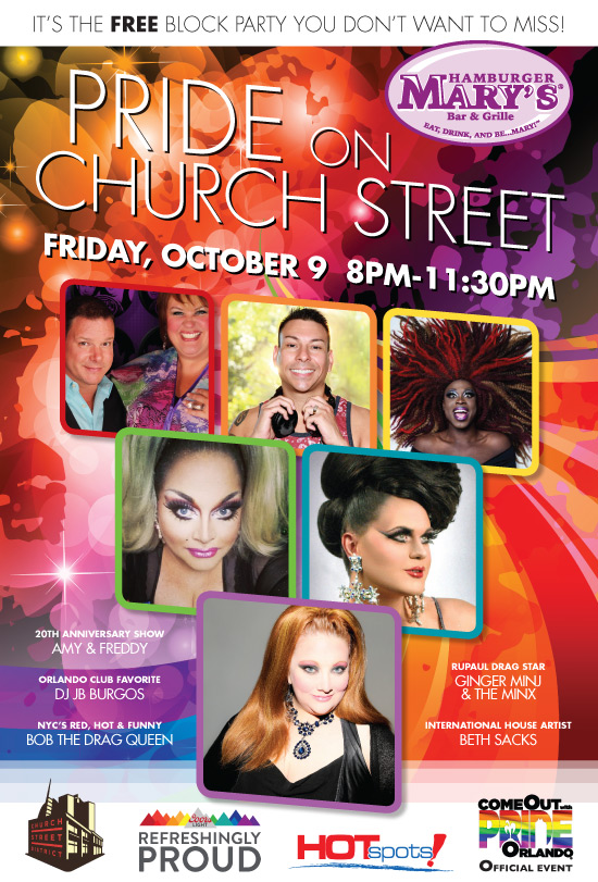
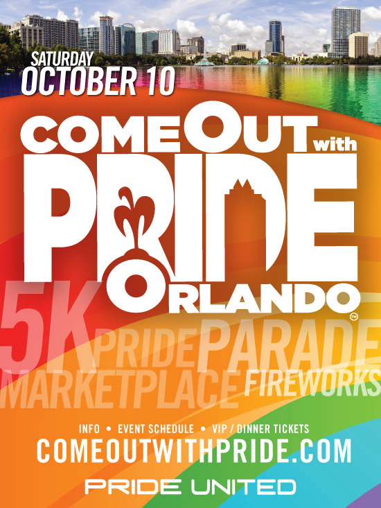
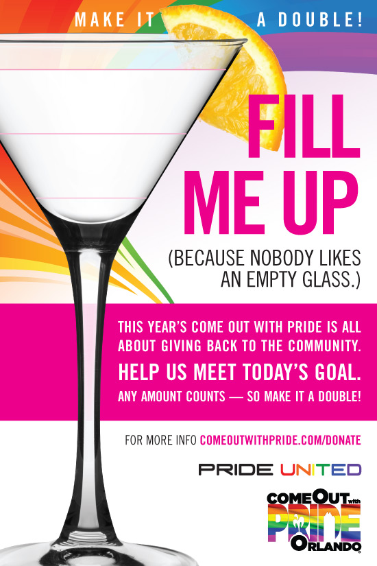
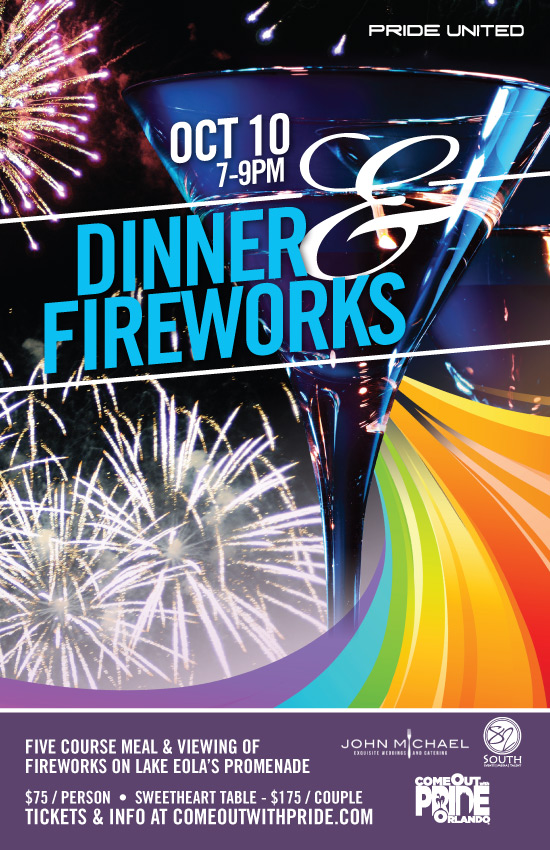
A colorful rainbow swoosh gave the campaign a sense of movement and a consistent visual thread. I used it across advertisements for the main festival and smaller events, giving the four-month effort a recognizable look across its materials.
A Different Angle
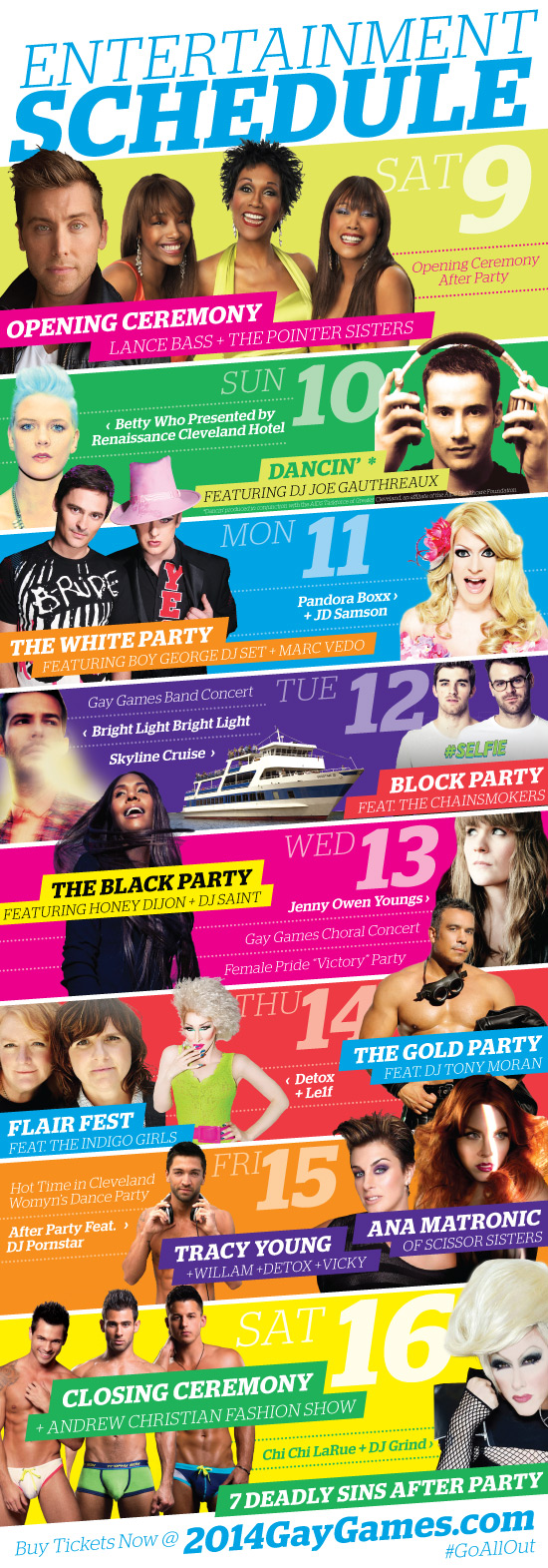
In the year leading up to Gay Games 9, the marketing campaign needed a flexible look for registration, event updates and advertising. A collaboration between two Cleveland agencies produced a bold palette that suggested rainbow colors without repeating traditional hues, plus an angled graphic system that worked across many formats. I used that foundation to create social media headers, posters and six-foot totem signs.
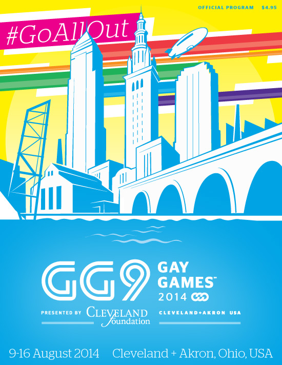
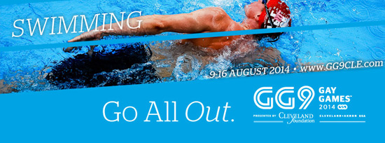
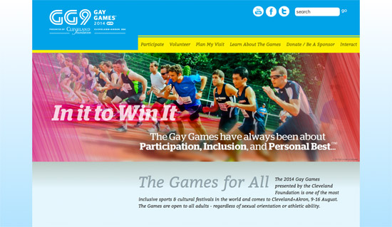
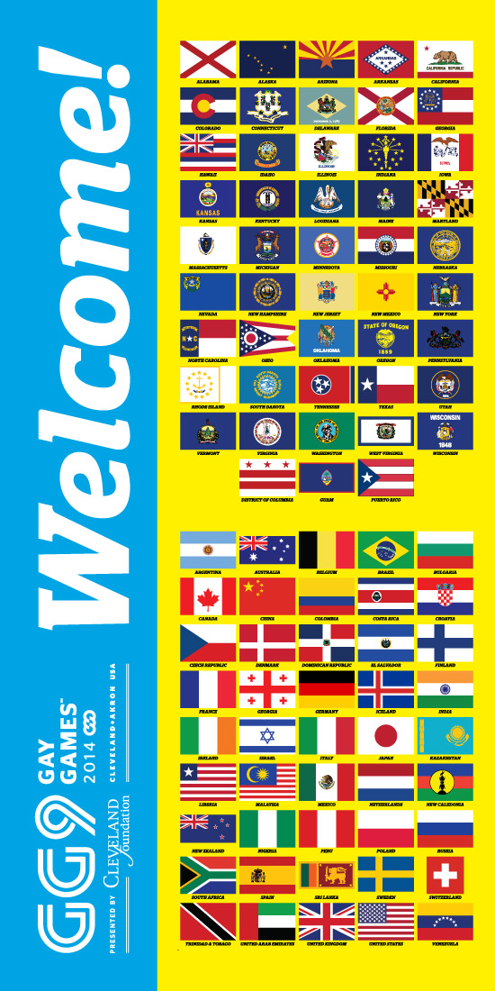
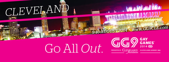
I also helped oversee a website refresh that carried the same graphics, typography, colors and photo treatments. Matching email templates linked registration and event updates with the materials participants saw around Cleveland and Akron.
When the Games arrived, residents welcomed athletes across both cities, and participants praised the experience. The event became the first Gay Games to finish without a deficit—a result of the work of many volunteers, organizers and partners.
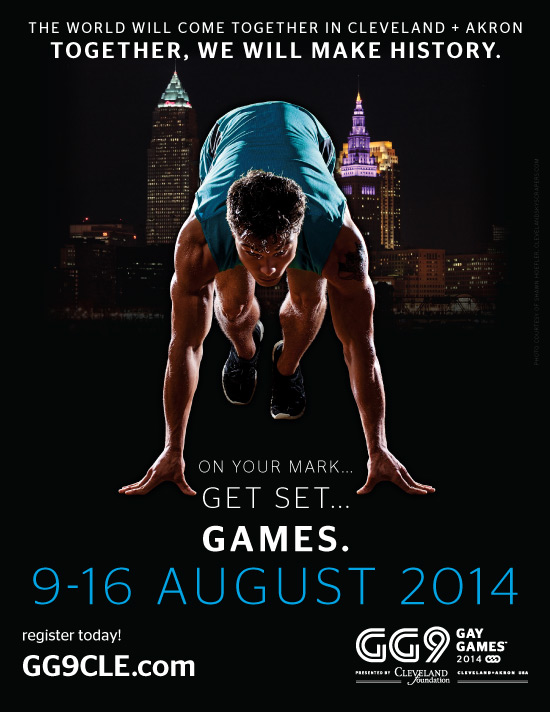
The “Games” is ON.
When I joined the Gay Games 9 marketing committee in March 2012, typography and color guidelines were already in place. What the campaign needed was a memorable hook for the 2014 event in Cleveland and Akron.
Hosting an international LGBTQ+ sporting event in the Midwest gave the campaign a distinct story. I focused on the moment just before a race begins: a track sprinter ready to take off, two cities ready to welcome the world, and the line “On Your Mark, Get Set… Games.” That combination gave early promotions the anticipation and energy of the event itself.
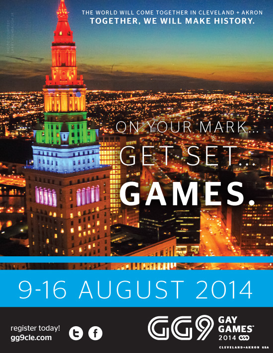
This case study references projects created while volunteering for the Gay Games 9 and Come Out With Pride. I do not maintain ownership or copyright of these images.